Project vision
It is an app designed for a cooking school in Boston, Massachusetts. The product has been designed to make more accessible the application process more to the school. It offers different cooking courses for all ages students with different schedules. It also provides video tutorials and booking reservation spots to help students during the application process.
Challenges
1. Design an app that make the application easy for everybody
2. Reduce the steps for documentation papers avoiding going to the school in person to apply
3. Make this school for everybody, doesn't matter on the background
4. Create different schedule to have the possibility to work during the school
Kickoff
In this project, I took a goal-direct design approach. I found qualitative research to be the most effective. I interviewed 5 participants, asked eight open-ended questions, and identified two response groups.
I created empathy maps; I evaluated what they said, what they thought, what they felt, and what they did about that.
Most importantly, my persona hypothesis construction. I started to ask myself these questions to myself.
Who is the user and what will need the most
How do I make the application easy
How can help the users during the scholarship process
What is it the product
What are the other challanges
How can help the users during the Application process


Meet the "Persona" Frank Cruiser

Affinity diagramming- First&second usability study
After the first usability study, I understood better the user's pain points and gathered the data. I used affinity diagramming to separate the data into groups of tasks to identify the patterns and prioritize the insights. After the second usability study, I understood that I had accomplished part of my goals.
After the first usability study
After the second usability study


Information architecture_Preparing for the journey
User flow from the start point to the finish point. This helps me to understand better user flow through the pages and how the users can achieve their goals.

Paper prototype

Low-fidelity prototype - Wireflow
After Sketching out some wireframes and thinking about the preliminary flow, I reviewed what was necessary for the user, and what areas need to be improved. Thanks to the Usability study where five participants tested the Low-Fidelity Prototype. I spent a lot of time making sure to finish all the steps before moving into visual design.

Iteration
After creating the low-fidelity prototype, I asked five participants eight open-ended questions. From that, I received much feedback about I could improve the design.

Users want to know
more about the chefs, experience and
achievements through the filter option.

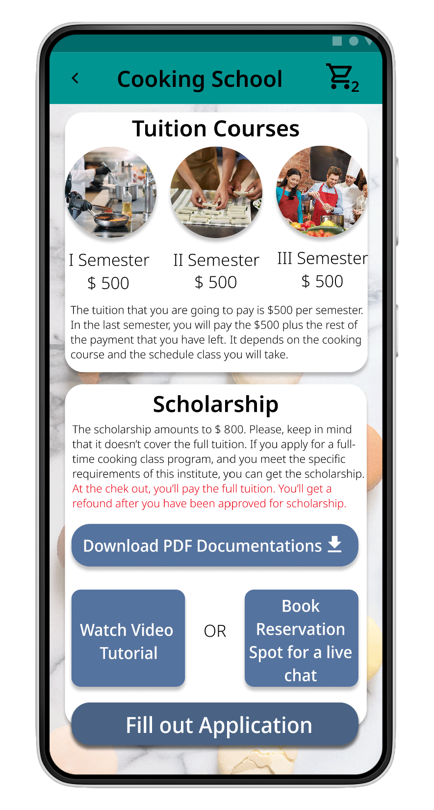
Users want to know more about the cooking course and they want to see the price when selecting the course.

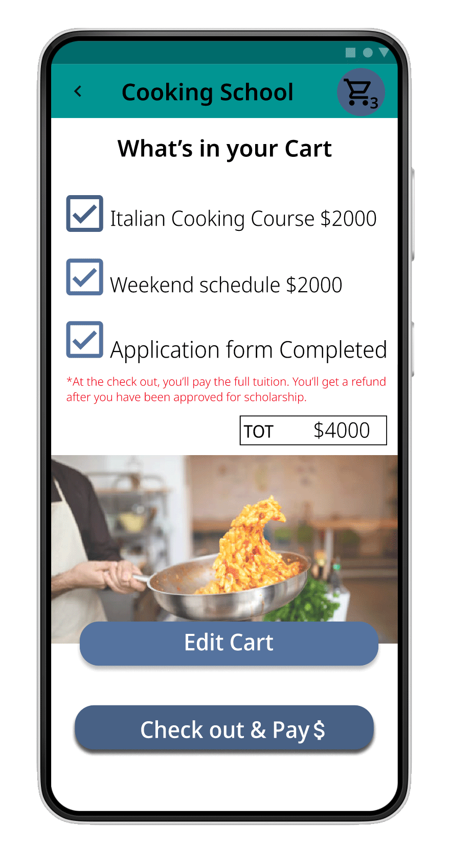
Users want to have more payment methods options.

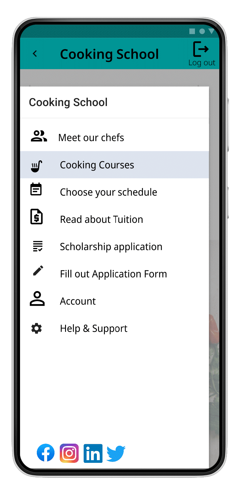
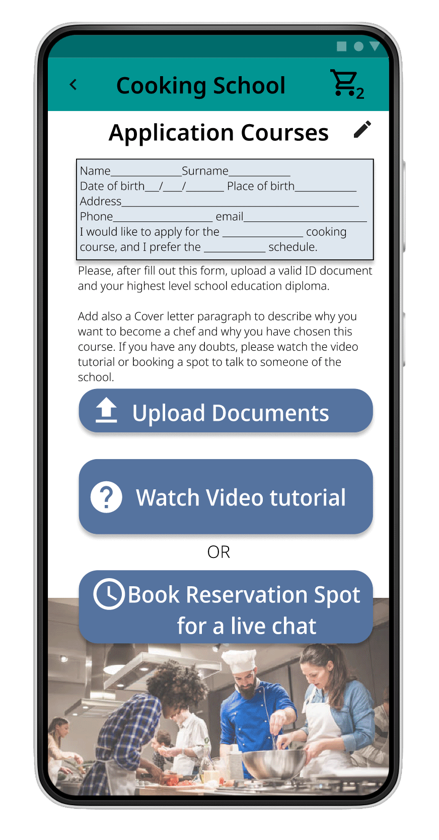
Users want to fill out an application form on the app,
no paper application to upload.

Users want to watch a video tutorial for istruction.

Users want to book a spot for a video chat for help during the process.
Old Homepage
New Homepage
Log in Page


Old Chef page
New Chefs screen with Filter